


Kate Spade New York:
when a subtle technique pops with colour
Collaborating on a launch is always rewarding.
It opens the door to a new world, you reveal a design, you bring it to life with substance and colour. And that’s even more true when the design starts with a fragrance celebrating a talented stylist.
Best known for her handbags, New York-based fashion designer Kate Spade launched her brand in 1993. With ready-to-wear clothing, shoes, and even a home line, each of her creations captured her modern, sparkling, colourful and feminine style. Advocating joy and optimism as a way of life, the brand quickly became a benchmark and drew international interest.
When Interparfums joined forces with Kate Spade New York to create a new fragrance, its teams looked for partners who would be able to bring value to its project. Here, the brand wanted to express sparkle, freshness, and subtle sophistication.
The Wauters teams were proud to take part in the packaging stage. Morgane Kandel, Group Manager for Purchasing and Packaging Development at Interparfums, talks about what happened behind the scenes during this wonderful collaboration. “We wanted to work with a well-trusted team to make the box, because it involved some technical challenges”.
Relief: a key element
The signature Kate Spade pattern covers the entire surface of the box. In a confidently feminine pink that really pops, the relief adds softness and impact. It creates an effect of depth and volume but has a very soft and controlled shape that creates a perfect curve.
“Embossing is the first challenge in this creative process. It is both powerful and gentle. And above all, to obtain regular relief over the whole surface, we use more than just an embossing or print registration tool, even though obviously they go some way to achieving the result we want. Everything comes together during the assembly process. We balance the pressure by adding materials in various places to absorb or strengthen that pressure: that’s the art of wedging, it requires the teams to deploy their empirical know how”, explains Céline Ribier, Technical Sales Manager at Wauters.
Don’t believe everything you see in print
The surface effects are barely perceptible, they play tricks with the eyes. When the surface material (Invercote 330g, Ed) does appear, it seems to be printed. It stands majestic in the central tray. A cool, elegant violet colour is printed in reserve in the background of the pattern, appearing as a luminous off-white. Do the logos and texts seem black? They are actually crafted in a deep, intense green.
“No fewer than four direct colours have been combined on this box. The pink of the spades is of course key, as it is an important identity marker, but the most delicate colour, the “violet” effect, involved a difficult balancing act. It’s very light, almost absent. It can veer quickly, and the minis/maxis are very tight. To achieve this subtlety, the formula contains lacquer, which makes the colour sensitive to light. We did a lot of testing to work out where the tipping point was, while maximising the sheer result”, explains Céline Ribier.
“We wanted a high gloss effect, which would highlight the relief of the ‘spades’. We enhanced the rendering of the gloss varnish by using a contrasting repellent varnish. The gloss varnish is applied all over, but the repellent varnish is superimposed in specific areas, and together they create an iridescent, almost pearly effect. We provided a model that had been designed by an offset specialist, and we knew that Wauters would rise to the challenge with a top quality result”, explains Morgane Kandel.
“It is always such a joy to work with Wauters: they are reliable partners, and have outstanding technical expertise. They really listen and they’re flexible and accommodating. We work together well and on our side we also try to be flexible so the production process goes smoothly. This new facet to the brand has opened a second chapter for us. The release of this new creation – with Wauters again – is scheduled for early 2022”.
We’d like to express our sincere thanks to Morgane Kandel for her faith in us, and for the high quality of her technical expertise and our working relationship.
Wauters and B.Pack teams
Find out more about Kate Spade New York Eau de Parfum
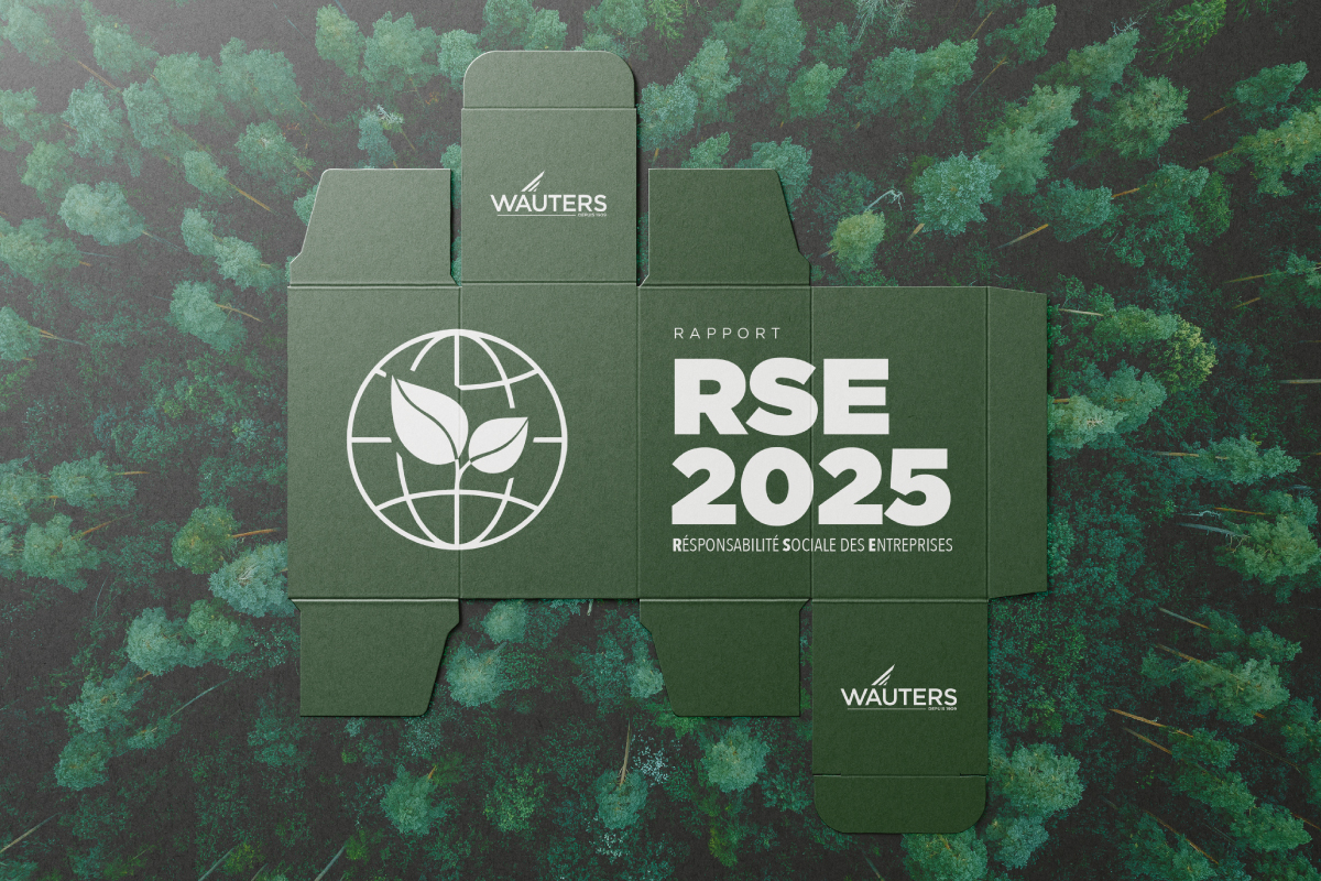
Communicating on Our CSR Commitment – 2025 CSR Report
Issues relating to climate, energy, resource management, working conditions, ethics and governance are playing an increasingly important role in the business environment.
In this context, we continue to strengthen our commitment to responsible and sustainable growth.
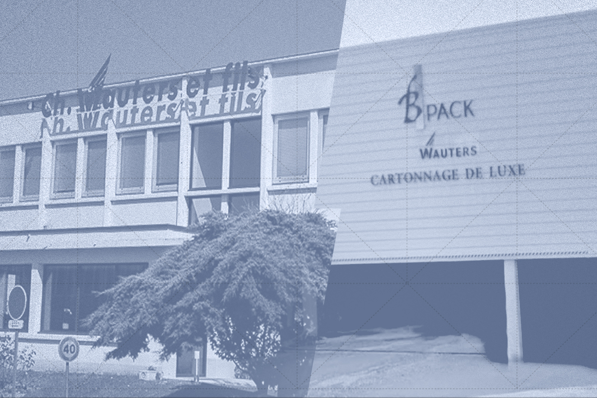
Operating excellence at the heart of our production model
Two locations, one coordinated industrial playbook. Although Wauters and B.Pack each retain their own identity and unique characteristics, the two sites now operate as a fully coordinated industrial network.This set-up enables the Wauters Group to meet a wide range of needs…

A three-part governance structure with a single vision
Over the years, the Wauters Group has adapted its governance structure to address a key issue: ensuring that its skills survive and thrive, its vision remains consistent, and that the Group can maintain its ability to plan for the long term.